


.jpg?width=700&name=SilverCloud_Template_2021_Social_Blog_700x400px%20(18).jpg)
How we use images throughout the SilverCloud platform
As soon as we open the apps on our phone or turn on our screens we are immediately viewing content – content which not only provides us with text but an image that helps our understanding of what we are reading. On most apps we use, we expect this image association, whether it be entertainment or news or simply when playing a game. This type of image-based content however is not expected when you open up a mental health-based app.
At SilverCloud, we believe images are important. Although our programs are a clinical intervention, we use imagery throughout the platform and we take time and care to choose which ones we use and why. In this article, we explain the process of how and why we choose images, give some examples of images and what they might say to a user.
Purpose of the images
At the core of SilverCloud is the content. Well researched and carefully written mental health and wellbeing programmes based on CBT that help users to learn and practice concepts to help with their depression or anxiety. The programmes are split into modules, each of which aims to help the user understand and learn a specific CBT topic. Within these modules, we have added imagery that serves as windows, adding colour, texture, and context to the module that resonate with its clinical goals. These images are to allow people to have a more experiential sense of the platform, which encourages them to sit with feelings brought up by the content, or to ‘try on’ new ideas or approaches. Some images also serve as navigational aids, assisting users in remembering the content of a particular module.
Selection of images
All of the photography used within the content are images taken by Karen Tierney, SilverCloud’s Chief Product Officer and Co-Founder. Karen has an abstract photography style, which has fed into the style and rules of thumb behind the images selected for the platform. Generally speaking, no direct photos of people are used in the content, aside from personal stories. The mind tends to compare itself with other people and this detracts from the content. Many of the images are of nature, which has been shown to be linked with positive feelings and helps create a calm, supportive space.
Photos tend to have loose, lateral, ‘feeling’ connections with content rather than direct, literal translations. They are intended to be suggestive, congruent, and sensitive to the content. They neither dictate nor impose nor invite comparison. They allow people to be present, to project themselves into experiential places that are both familiar and strange simultaneously.
Below is a selection of examples of images of the platform and how they relate to the content.
Examples
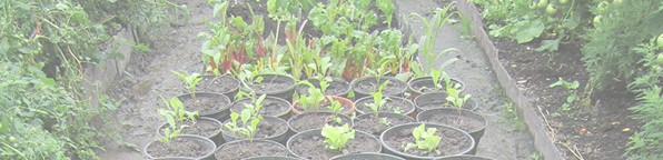 Seedlings in a greenhouse (Jampa Ling Monastery, Cavan)
The Getting Started module is the first module many users will encounter, and this will be one of the first images. It is intended to represent new beginnings, new growth in a safe environment, and optimum conditions for growth. Also visible on the right-hand side are green tomatoes representing the potential for ripening to full potential. The centre aisle has single plants in pots that depict a more ‘controllable’ and handpicked approach to growth against the ‘wildness’ or intermingled greenery of the side beds.
The style and technique used for this image are representative of many images selected for the platform. The cropping, along with a low perspective draws the viewer’s attention to the centre row so the eye moves from new growth in the foreground to higher growth in the background, suggestive of a journey over time and could also be seen to reflect the layered approach to building up the TFB cycle in this module. This module sows the seeds of CBT for users and also introduces them to mindfulness as a grounding exercise.
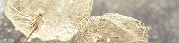 Lanterns that have lived, now dried (Garden in the Black Pits, Dublin)
This photo accompanies the Noticing Feelings module, which aims to help users learn more about emotions, what impacts them and how to tune into their own feelings and emotions. In the image above, the dried lanterns are fragile structures that are beautiful and ephemeral, but difficult to hold onto or grasp fully or firmly, much like emotions. They give the sense of being able to breathe through them, as you would through difficult feelings. Each lantern contains a seed kernel that can represent both the plant’s purpose and the hope of new growth.
Again, cropping and depth of field techniques are used here. The close-up nature of a macro shot gives the sense of the dried lanterns being literally under the viewer’s nose. Different depths of field draw the eye around the image, as well as highlight varying foregrounds and backgrounds, thus creating a dynamic 3-d feel or sculptural quality to the image which invites the viewer into the image plane. Unusual cropping presents the lanterns in a curious and unfamiliar way, inviting exploration and interpretation. In this module, users are also invited to take a closer look at their emotions, recognise their physical body sensations, and explore how activities can impact them.
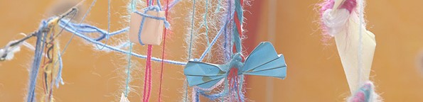 Paper tied to string (wishes on a string, art room – Barretstown, Kildare)
The Challenging Thoughts module brings in techniques to help users apply what they have learned in previous modules, learn how to reframe, and challenge their thinking. The image for this module represents thoughts as mutable – from stone to paper, from ground to air. Empowered with knowledge from the previous module and a new sense of what thoughts are, there is the idea that we can learn how to untie those thoughts that are not working for us / working against us.
The close cropping and unorthodox framing in this image brings the viewer’s attention to a single piece of tied paper, in much the same way as the actual experience of being in the same place/room as the artwork. This also reflects the module’s clinical goal of learning to recognise ‘hot’ thoughts that carry a strong emotional charge, and how to unpick them.
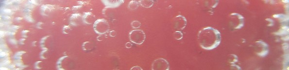 Raspberry with bubbles (Drink at wedding in Dingle, Co. Kerry)
This photo accompanies a module that focuses on worry and the role it plays in anxiety. The image suggests the feeling of bubbles in your belly and how visceral a sense worry can be. Like fizz in a drink, worry bubbles up again and again; it can move in tangents and different directions from the source. The red in this image represents the deep interior of the self. The bubble clusters are the worries made tangible; the fragility of the fizz and the sense of light affords the idea that worry might be something that could be shaken off.
Again, cropping and depth of field are used to create an immersive experience as the softness of the edge bubbles mimic or reflect peripheral vision and position the viewer right at the centre of the image. A close crop obscures the true nature of the red object (raspberry) and focuses the viewer’s attention on the bubbles instead. The sharpness of a single bubble is also reflective of the module’s clinical goal of problem-solving worries one at a time.
Conclusion
It is standard practice to place images beside content online, to give context, add meaning and create space or a break in the content. When creating content for a clinical intervention, the selection of these images is very important. Working on your mental health is not an easy task, and the images throughout the platform add an extra layer of space and meaning for the user to reflect on what they are learning, about CBT and themselves.
You can read our other blogs in our user experience series here: How Do You Solve a Problem Like Engagement?, Developing Product Principles, and User Research in Mental Healthcare.