


Over the past decade, digital mental health treatments have been steadily on the rise to address the gaps in access to traditional methods of care. This rise has rapidly accelerated over the course of the COVID-19 pandemic. There are more ways than ever to access help for mental health however, issues like engagement and trust are still barriers to people using these new digital solutions. Alongside this, there is also an increasing awareness of how digital products can manipulate users, whether this is buying products, giving away their data, or creating addictions. A user of a digital mental health product might rightly wonder if it is using the same type of manipulation.
Dark patterns
These types of manipulations seen in digital products are called dark patterns. The term was coined in 2010 by Harry Brignull, describing “the interface features that have been carefully crafted with a solid understanding of human psychology, but without user’s interests in mind.” Elements of a product that may seem like mistakes or oversights, may have been intentionally designed to push the user into a certain action. These dark patterns tend to prioritise the needs of the business, such as sales or engagement, over the needs of the user. In this article, we will discuss how we have avoided the pitfalls of dark patterns, using our product principles to guide our decision-making. Our principles of ‘prioritise safety and security’ and ‘keep it simple’ in particular have helped us to create a space that allows the therapy to work effectively.
General Dark pattern categories
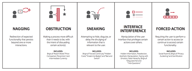
Reference: Summary of dark pattern strategies from ”The Dark (Patterns) Side of UX” by C.M.Gray et al, 2018
Privacy
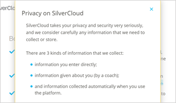
In the digital world, users must constantly make decisions about privacy and security. These decisions most often occur at the beginning of use, on the first view of a website, or during the sign-up process of a product. This is also where many of the dark patterns related to privacy occur, often obscuring or overly complicating privacy decisions with the aim of getting the user to disclose additional personal information A 2020 study of popular consent management platforms found that 88% of the top 10,000 UK websites contained dark patterns relating to privacy. Users of SilverCloud might notice there is no cookies consent section on the sign-up website or the platform. We have taken the approach of privacy by design. We don’t use invasive third-party tracking linked to advertisers and we avoid collecting any sensitive information from users until they have clearly signed up to the service.
Another recognisable pattern is the use of hidden legalese stipulations, in other words writing terms and conditions in complicated legal jargon that can be hard to grasp. The result of this is that many users skim or don’t even read the policies of the product they are signing up for. During SilverCloud’s sign-up process, we have given these terms a dedicated page, allowing the user to focus on the content. The main points of the agreement are laid out in bullet points, avoiding jargon and using plain language as much as possible. By making the terms as easy to read as possible, we are increasing the chance that users will read them in full, reducing the instinct to skim. For users who want to know more, all additional information is layered in through the links which have also been laid out in a way that can be read and understood quickly and easily. The button to move to the next page is labelled “I understand and agree”, again reinforcing the need to comprehend the terms.
.jpg?width=450&name=image%20(1).jpg)
Another common dark pattern in privacy is the practice of creating complex and confusing interfaces to change privacy settings. This practice is known as Privacy Zuckering, a term coined by Tim Jones to describe Facebook’s use of this type of pattern in their privacy settings.
Most users of SilverCloud are supported by a coach who reviews what they have done and offers support and encouragement. Some information is shared with a coach by default, such as what pages were viewed or how many times a user logged in. Other information, like journal and tool entries, the user must choose to share with their coach. To do this, there is a share button underneath each piece of content that can be shared with a coach. The first time a user comes across this, there is a pop-up explanation of how it works, giving them the information in the context of use.
By placing the share setting right beside the content, it is clear to the user what they are sharing, and they can also ‘unshare’ at any time. They can also review everything they have shared with their coach in the ‘My Journey’ section, which uses the same format of a share/unshare button underneath each individual item.
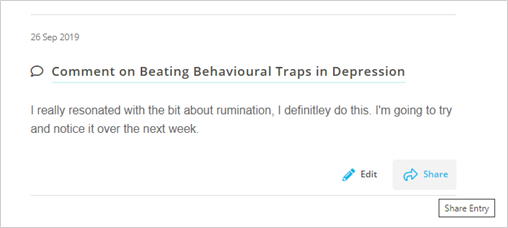
Example of a journal entry (Not a comment from a real user)
Engagement
Dark patterns relating to engagement are usually focused on maximising the time users spend on an app or website. These are most likely to be used in business models that are based on user engagement, such as the industries of gaming and social media. One of the most common strategies used when trying to increase engagement is gamification, which involves introducing game elements to make activities more attractive to the user. This can be helpful in certain contexts, for example, the app Duolingo has used gamification very effectively to make the process of learning a language fun and engaging. However, in the context of mental health treatment, these same gamification strategies could be detrimental.
The most used gamification tactic in digital mental health apps is the use of progress feedback and rewards like the examples below. For a user with depression who might have low motivation, being reminded of a lack of progress might only de-motivate them further. For a user who is very anxious, these types of patterns might increase their anxiety. We have heard anecdotal reports from our supporters about users who rush through the program to ‘complete’ it. This is not the kind of engagement we want to encourage, nor the feelings we want users to have when they use our platform.
On the SilverCloud platform, we keep progress feedback to a minimum, being careful not to overemphasise its importance. Instead, the content encourages users to practice what they have learned in their daily life, rather than completing modules. There is also an absence of ‘user stats’, i.e., how many times they have logged on or how many meditations they have listened to. On the surface, increased usage of a mental health app seems like a positive, but usage doesn’t necessarily mean a user is achieving cognitive and emotional engagement with the content (read our previous blog ‘How do you solve a problem like engagement?’ to find out more). Encouragement on SilverCloud comes from our human supporters, who can provide feedback to a user that is much more personalised and meaningful than generic, automated messages.
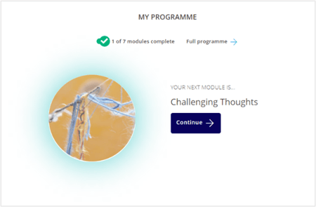 Progress indicator on the homepage
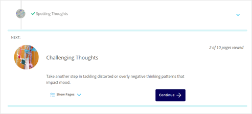
Indicators of progress through the programme
Another common engagement pattern is the use of levels or ‘forced action’, requiring a user to complete one section before moving on to another. While our programs are laid out in a linear fashion, we recognise that everyone’s mental health journey doesn’t follow the same path. Users are free to explore the programme at their own pace and decide what is most relevant to them at that moment. This also reinforces a user’s autonomy, empowering them to make their own decisions. For a user who is not sure where to start, the linear structure is a path of least resistance that guides them through the content.
Conclusion
The use of dark patterns in digital mental health is not necessarily the result of a lack of ethics or malicious intent. These types of patterns are prevalent, so if you are looking to increase engagement, for example, it would be easy to copy strategies that work well in other areas. However, designing for mental health requires deeper thought and care. More than anywhere else it is essential to keep the focus on the human at the center of the experience. While the examples above may seem like small design choices in isolation, they add up to create a safe and supportive space for our users. Creating this type of space is crucial for a digital mental health treatment to work effectively. With the help of strong product principles and a focus on meaningful engagement, we can avoid the pitfalls of dark patterns.