


The process of developing relatable and diverse characters to help explain clinical concepts and guide users on their journey
SilverCloud aims to provide the space, structure, and support to help people think and feel better. This is achieved through the platform’s use of content, images, and illustrations. We made the decision to upgrade the illustrated characters used in the Silvercloud platform to improve user experience and help our users to feel better represented. As part of the process, we made the distinction that the therapeutic content of the SilverCloud platform and the illustrated characters that populate the platform, fulfil different roles, but ones which must complement each other.
The written content forms the voice of SilverCloud, and this voice should be:
- Calm but not superficial
- Safe but not restrictive
- Empowering but not a crutch
- Challenging but not forceful
- Guiding but not directing
- Knowledgeable but not dictatorial
- Supportive but not coddling
The illustrated characters fulfil a different role – that of the peer, the person who has gone through it, and the friend. They needed to be able to express a range of emotions and it was important that they were adaptable and reusable in different contexts.
We decided that, although the characters may be used to depict someone experiencing a particular mental health condition (e.g. depression, anxiety etc.), they shouldn’t display any symptoms of these conditions. We would prefer them to come across as individuals, who could appear one way on the outside, but might have a number of things affecting them on the inside. The point of this was to make clear to our users that everyone experiences mental health difficulties at some point in their lives, regardless of how things may appear on the surface.
We also wanted our platform characters to embody our core product principles, most notably ‘Convey warmth’ and ‘Include everyone'. Through a cross-functional workshop, we determined a set of traits that we would like the characters to have. They should be:
- real – honest, relatable characters that are flawed, but aren’t pigeon-holed or stereotypical.
- friendly and warm, but not cutesy or childish.
- playful, but not too silly or trivialising (a balance between the light and the dark).
- unconventional, quirky and interesting.
- engaging and likeable – someone you’d like to have a cup of tea with.
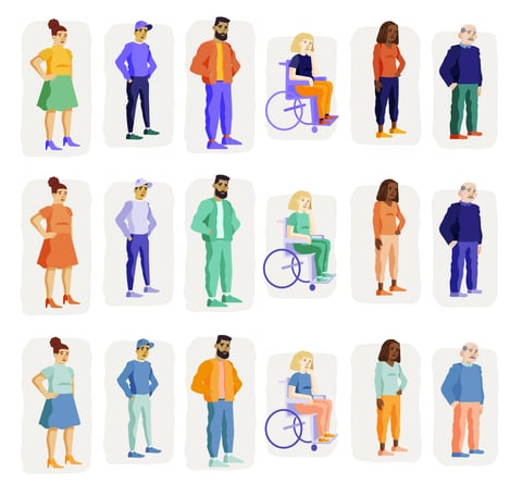
- diverse – across age, gender, shape/size, ethnicity, and ability.
The original illustration style
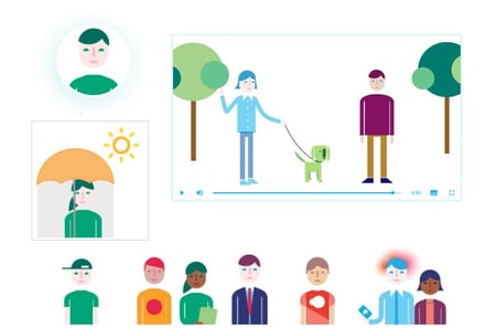 The original illustrations used on the platform were created with a generalised look and feel. They were developed using distinctive, clean geometric shapes and showed a range of people, without going into too much detail. This was purposefully done to leave the characters open to interpretation by the user. The images used the calming tones of the branding while also using brighter colours to help them stand out.
They were created to be adaptable and easily animated in different contexts. But their intended simplicity did not lend itself to showing more human and relatable characters. There were also limitations to these flat, two-dimensional characters, for example, it wasn’t possible to show characters with a range of emotions or even a variety of body types.
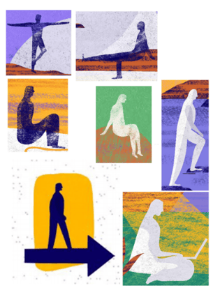
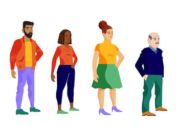
So, we made the decision to develop characters for the platform in-house. We worked with an illustrator to develop characters that fit the platform’s personality. Through an iterative process, our final line-up of characters was chosen. The final lineup can be seen below.
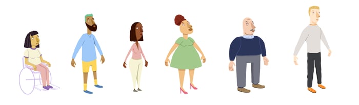 These illustrations had moved away from the standardized shapes used for characters and brought more diversity in terms of body shape, age and ethnicity. They have a distinctive hand-drawn aesthetic and use softer shapes. The characters have more expressive faces and more relatable features.
SilverCloud rebrand
After we had developed our full line-up of new characters for the platform, our company began the process of going through a full rebrand. This included an overall redesign of our collateral and illustration style, so we put the development and rollout of our new platform characters on hold until the rebrand was complete.
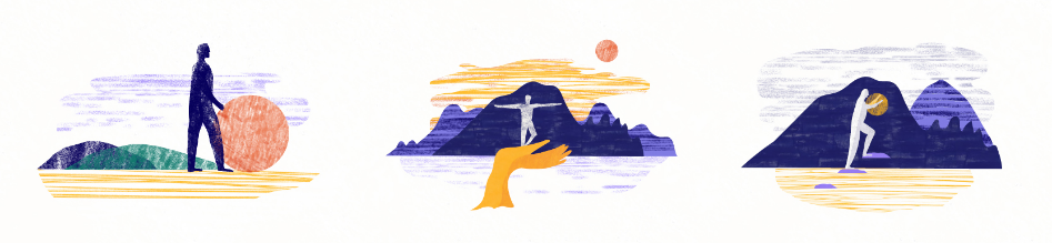
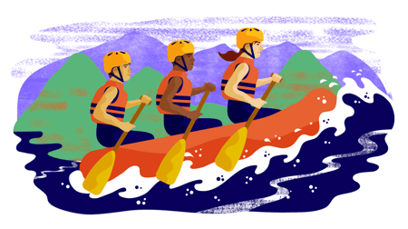
For the rebranding project, we felt it was important that it would be informed by concepts from our platform. One of these key concepts was the foregrounding of nature, this then became a core design principle in the development of our new illustration style. In many parts of the platform, we use photography and imagery that depicts nature. Research has shown that “regular contact with green space can enhance well-being and alleviate stress.”1 Our aim, therefore, was to bring some “green space” into the digital world, where people would see it on our platform and feel some of the benefit. So, we needed our environment to feel more organic in its shapes and movement, and the use of textures and colour could help convey emotion within the illustrations. We wanted something that was a little more unique in its appearance, a move away from the generic nature of the original style.
The beautifully designed illustrations delivered on many key areas. The prevalence of nature, the flowing shapes and the use of colour was congruent with our platform's aesthetic. The illustrations were simplistic and not overly designed. The use of texture allowed for plenty of white space, keeping the images light and ensuring that they were not overbearing.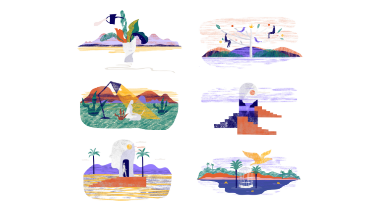
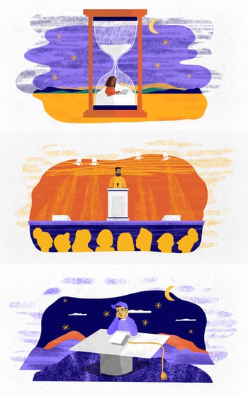
From the above examples, we can see how the environments overlap with the criteria we wanted for our platform characters. While we felt that we had successfully developed the SilverCloud environment, the characters developed in the company rebrand still seemed a little too abstract and distant for our needs on the user-facing end of things. The use of single-tone colours, the lack of features and different body shapes, did not portray the diversity and warmth that we felt it was important to represent. At this phase of the project, we needed to re-evaluate our character designs.
 Merging the two styles
As the rebranding proceeded it became clear that there was a disconnection between the illustrations needed for marketing materials and the illustrations needed on the platform. The marketing images tended to be more metaphorical and abstract, whereas the platform images had to be more contextual and personal. So, our designs needed to portray situations more relevant to our users.
Our first task was to explore if the characters we designed inhouse could work as they were with the new illustration style, or if we needed to redesign our characters to match this new style. We mocked up and tested these approaches, comparing them side by side to see if they could fit or be blended together. We worked on different variants, mixing and matching elements from both styles.
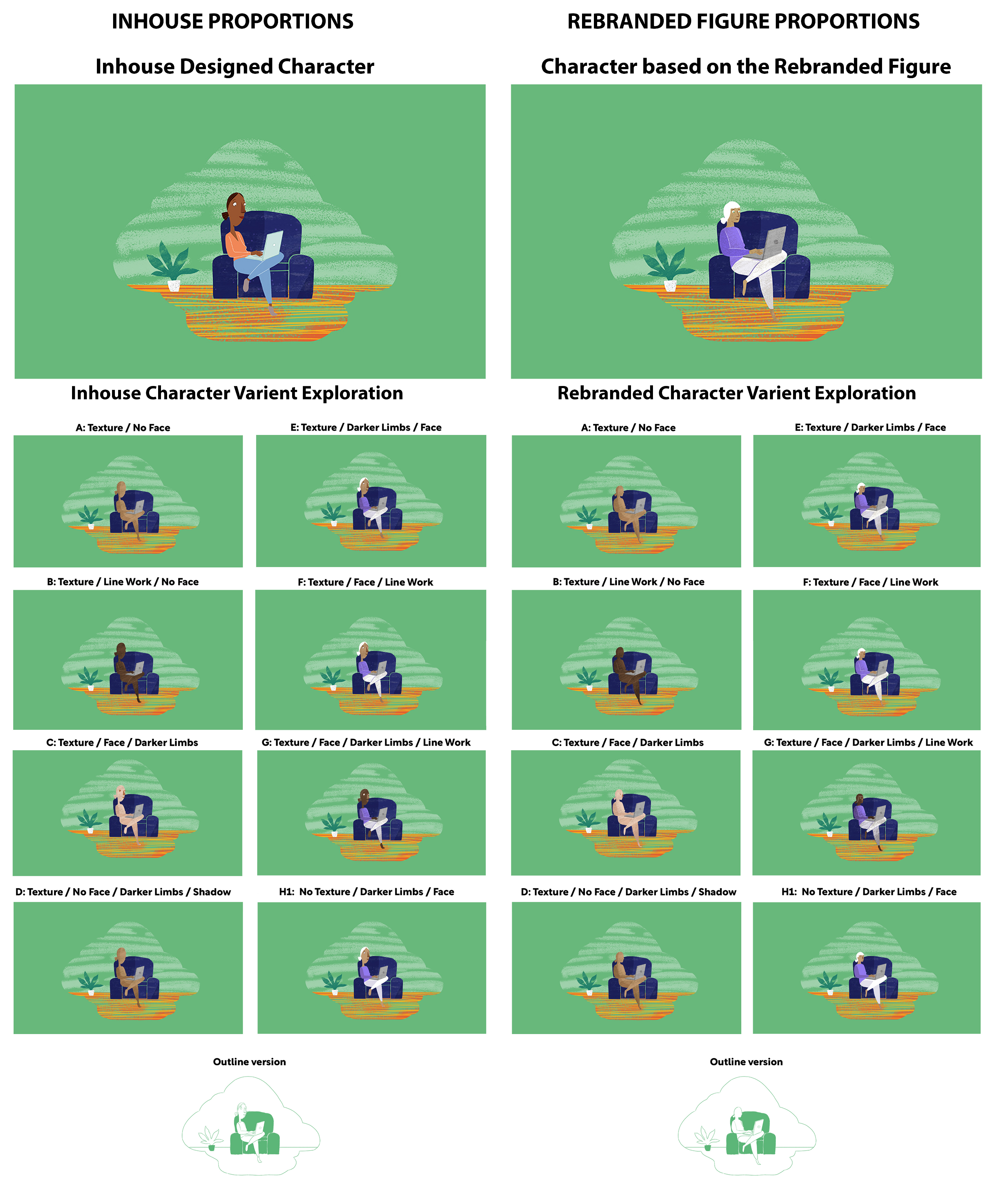
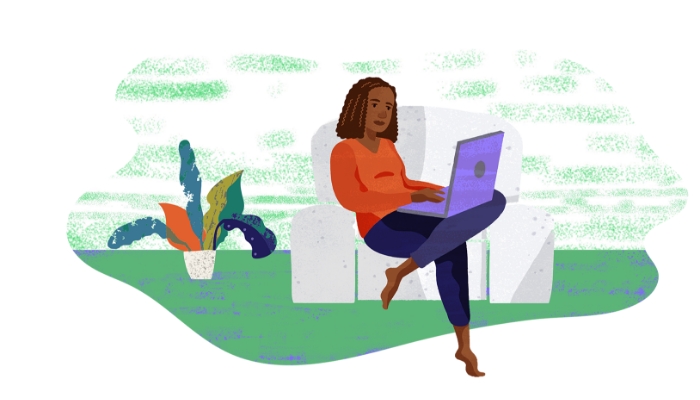
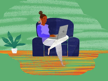
From the examples that you see above, we felt that they didn’t quite work as we hoped. The body proportions and colour used from the inhouse characters we designed didn’t match the illustrated environments. They needed more volume, shape and natural flow. We kept working on it and towards the end of our exploration, we designed the image below. This finally felt like a more comfortable marriage of the 2 styles and therefore became our new reference point. The big shapes, the natural flowing lines and the use of texture made the illustration feel real, warm and engaging. It touched on many of the aspects that we were looking for, from our original brief and would sit within our new illustrative world.
 Through the lens of our reference drawing, we went back and reviewed all the new illustrations from the rebrand, determining a set of rules and guidelines, based on the drawings, working out how we could incorporate these into our final platform characters. We paid attention to the use of straight lines versus flowing lines and organic shapes. We assessed how weight, shadow and texture were added to the pieces. Noting these critical design details would guide us in progressing the project.
Developing the new characters
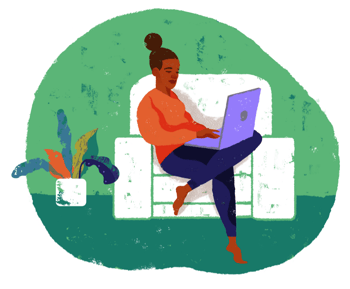
We used our in-house character lineup as a starting point for this process. We took care to reflect the use of organic shapes, hand-drawn qualities and painted textures that had been used in rebranded illustrations, while also moving away from the more dream-like quality of the imagery. The characters had to feel and look like they were everyday people in everyday situations. The new character lineup became a blend of the different variations of the characters we developed. Our next focus was to have clearer facial expressions, ensuring that the characters would also be better suited for animation.
.png?width=450&height=253&name=Character-Lineup%20(1).png) Proportions, shadows and facial features
Proportions, shadows and facial features
Working from our two styles we created a scale, placing our different characters at each end and designing variant options in between, to help us decide which proportions would work best. We found we needed a larger head shape to allow for the facial features to be read more clearly. We altered the proportions of the characters’ bodies to 7 head heights instead of the 8 head heights used in the illustration rebrand, accommodating the larger face area we needed. We also looked at the length of the characters' limbs and decided to stick closer to the proportions of the rebranded figures, as they felt more natural and appealing. We now needed to work out how we would colour the characters and if we should use shadow, line work, or both, to help define the characters’ faces and bodies.
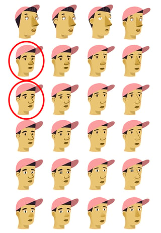
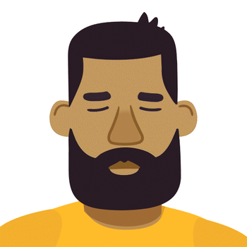
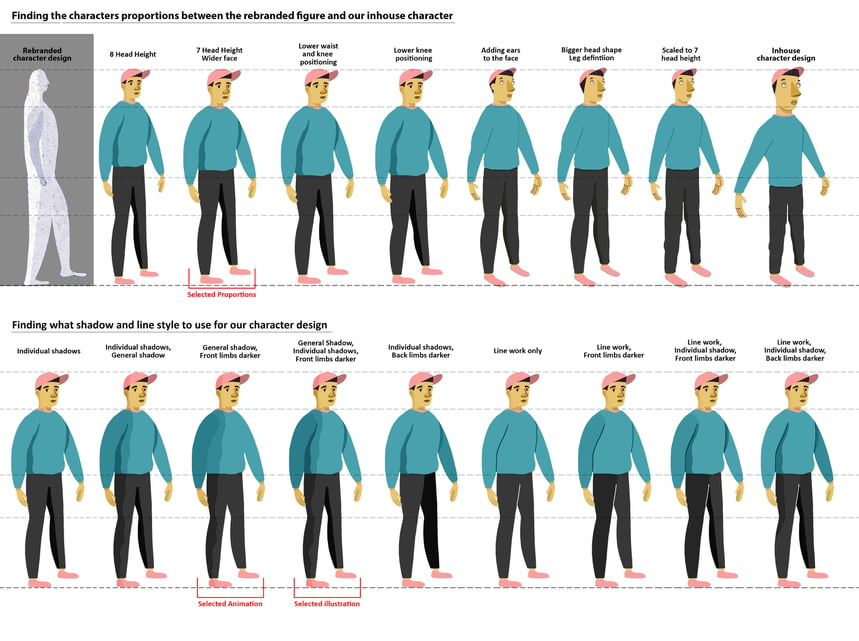 Using the new illustrations’ single-tone figures as a reference, we kept some of the same principles used in the development of our own characters. For the animated version, we choose to move forward with darker-toned limbs on the front, with an area of the character’s body in shadow. For the illustrated version of the characters, we found that the addition of extra, individual shadows added depth and definition to the limbs. For the facial features, we did a full rundown of options comparing and blending our original in-house designs with our new reference point character. We took into consideration the size of the nose, eyes, ears, and mouth and the positioning of these features, alongside the colours, gradients and line work. As shown in the image below, we felt the two circled designs were the strongest options. The single-coloured eye and eyelash line helped define the eyes best, and the bolder line for the nose and ears with a gradient colour helped the features stand out more clearly.
 Finally, for the animation, we looked at how much movement and expression we could get from the eyebrows, lashes, eyes and mouth shape. Below is a gif demonstrating the range of movement and expression our characters can have.
Colour use for platform illustrations
In order to contrast with the more subdued and calming tones of the platform UI we decided to try out the new branding colours, which are bright and bold. Different colour palettes were assessed, to see how they might work. Softer, pastel colours were explored but were dismissed because they either blended in with the UI too much or had unintended connotations (having a character in just one colour was perceived as looking too much like a uniform). The bolder colours helped the images stand out and avoided adding more somber elements to the platform.
 Going forward, all the images will now use this blending of illustrations, creating a bridge between the marketing imagery and the platform illustrations. With this representational character design, we hope that the imagery on the platform will give users a more comfortable and relatable experience. The images are designed to represent the nature-orientated aspects of the platform, while also retaining figurative representations of everyday users. We hope that these images will complement the tone of voice of our platform, creating a space that is both warm and inclusive for our users.

References
1. Van den Berg, A., 2017. From Green Space to Green Prescriptions: Challenges and Opportunities for Research and Practice. Frontiers in Psychology, 8.
Authors
Barry Hughes and Dara McLoughlin are both members of the product team in SilverCloud Health, helping to build our clinical programs and platform. Barry is a UI designer working on translating clinical concepts into illustrations and interactive tools. Dara is a motion designer, he creates the animations in the programs which accommodate different learning styles and help bring clinical concepts to life.