


March 3rd, 2019 - SilverCloud Health has supported over 200,000 users to date, with 50% of those having joined in the past 12 months alone. An integral part of this service is the supporters, who play a crucial role in making the program accessible and attainable for clients. Much of our work in the development/design team is focused on clients and the client side of the platform. However, in terms of the platform architecture, the clients and supporters are two halves of the same whole and last year we had focused on improving the experience of the client, so now it was time to do the same for the supporter side.
We started by interviewing internal stakeholders - customer success managers, the clinical team, anyone who has contact or works with supporters and would have a good understanding of the supporter’s role. We soon found that while supporters essentially do the same job, different services have very different setups which can really affect the way supporters work and their use of SilverCloud as a treatment pathway. The next step was to talk to supporters to find common issues across this range of services.
Research
Talking to people allows us to define design problems by seeing patterns based on people’s different experiences. When we don’t even start by talking to people or include them in the design process, our designs are inaccessible.
- Tiffany Eaton, UX planet
We collected the opinions of our supporters through a short survey on the SilverCloud platform itself. This allowed us to find out their general views towards cCBT (computerised cognitive behavioural therapy), SilverCloud as a cCBT intervention and the parts of SilverCloud they felt could be improved. From this initial phase of research, we had a hunch on the types of issues that were arising, for example, training of new supporters. This survey also allowed us to recruit supporters who would agree to participate in a more in-depth interview. These interviews took place over Skype and were the most informative part of our research. We had a set of topics to discuss, followed by a task in which the supporter would share his/her screen, allowing us to observe their process for doing reviews (demo/fake clients were used). Seeing a supporter’s workflow really gave us an insight into how practiced the review process is, with some supporters having done thousands of reviews. It was great to see our expert users at work and to see their passion for using and improving SilverCloud.
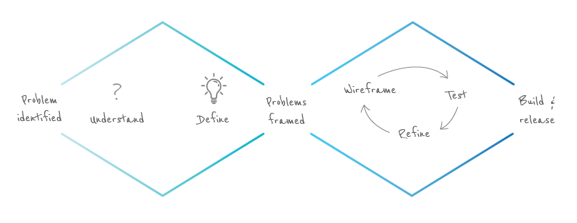
Solutions
Main issues
The next phase was to collate our findings and try to come up with solutions for common pain points. On the platform itself, there were some obvious fixes, such as improving the view of the TFB . There were also opportunities for bigger changes such as a new layout, which may take a bit of time for supporters who are very familiar with the existing platform to get used to but could give their review process a far more efficient workflow. Then there were bigger issues, such as the training of new supporters. Again, there is no quick fix for this as training is something that varies between services, dependent on time constraints and resources. This necessitated some more research into the current methods of training and how we could improve them.
Quick Wins
To focus our solutions, we decided to drill down into the day to day tasks of supporters within the SilverCloud platform. To get some quick wins we chose to start with some improvements that could be made for supporters immediately.
1. Upgrade the help centre - The previous help centre had been a small collection of pdf’s on best practice and research papers. The new help centre has a range of new articles and how-to’s, generated directly from the most common support requests from supporters (e.g. how to change a client’s password etc.)
2. New help button available on every page - where you can search for articles and topics.
3. Add-on feature to the message templates - This new feature allows supporters to create and then reuse paragraph templates for certain topics and messages that they might be sending out multiple times to different clients. Many supporters had been doing this already with a word doc of common paragraphs they would use for reviews, so we have removed this extra step by embedding the feature in the platform.
All the quick win changes have been live since late November.
Bigger changes
Alongside this we came up with some wireframes for the bigger changes and features that were proposed such as a new layout, module cheat sheets and having a client notes section. Once we had come up with some wireframes, we sent these back to supporters for review. It was important to get feedback from supporters again at this stage to validate our ideas and ensure we were going in the right direction. After validating and finalising these new features it was time to build them. , before being released for everyone.
1. Client review page - redesigned for efficiency
The biggest change made has been to the layout of the client review page. The aim of the redesign was to improve the efficiency of reviews, ensuring that supporters have everything they need to hand in a single view pane. The revised tab structure allows supporters to switch back and forth between previous reviews, while writing the current one. The side-by-side layout of the activity and feedback panels also allows for viewing activity and writing a review at the same time.
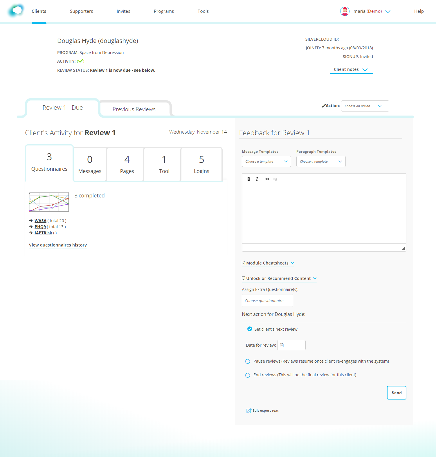
Three brand new features have also been added to this page;
1. A section to add notes about a client has been a highly requested feature, which is now available in the top right-hand corner. These notes are just for the supporter’s reference and will not be linked to a patient management system.
2. Module cheat sheets - Supporters were finding it hard to remember what was in each module and which tools were available in different programs. To address this issue a description of each module of a client’s program is now available underneath in the feedback panel. It provides a summary of the goals and core tools of each module.
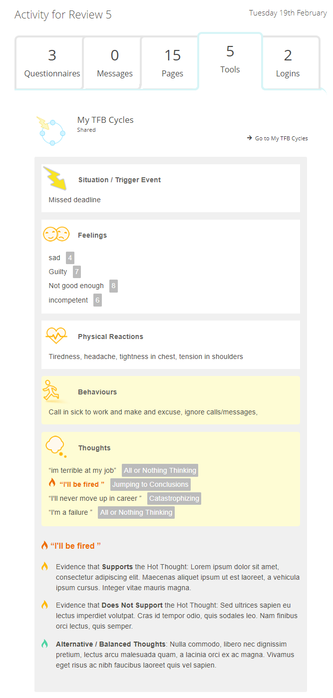
3. TFB cycle tool - When supporters are looking at a client’s activity, the TFB tool was hard to read and it was difficult to identify which of the client’s entries were new. The layout of the TFB has now been improved for supporters (the client’s view will remain the same). New or edited entries in a TFB cycle will now be highlighted in yellow. This feature is something we are looking to roll out to other tools in the future.
2. Onboarding for new supporters
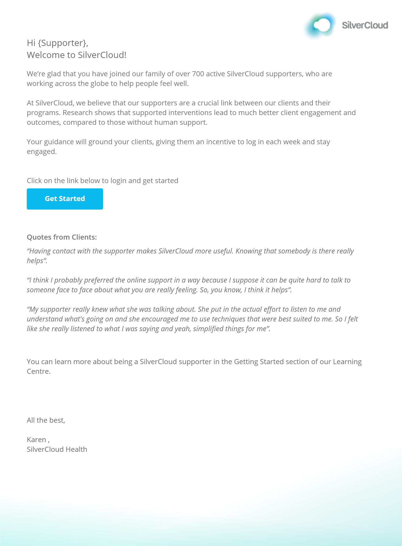
Another issue that we wanted to address was how new supporters learn SilverCloud. There is no one simple solution to this issue, rather it involves a range of strategies. We looked at the journey of onboarding a new supporter which again, is different depending on the service in which they are working. One element of the onboarding process, which is common to all supporters, is the emails they receive from SilverCloud. Last year we focused on improving this process for clients and now it was time to do the same for supporters. A simple start was to design a series of welcome emails for new supporters that would introduce them to the main features of the platform and help them understand what SilverCloud was about.
All the above bigger changes will be available on March 21st. We hope these changes and features will improve the experience for our supporter's day to day workflow and also improve the experience of new supporters learning to use SilverCloud. We invite feedback from you on these changes to let us know how you are using them. Improving the supporter experience is an ongoing project, the next phase of which includes new training and big updates to the help centre to ensure supporters have all the resources they need. We hope to release this in the coming month.
About the Author
 Maria Lyons is an UX Designer at SilverCloud health. She is interested in improving the digital experience for people with mental health difficulties through human-centred design. She has a master’s in Interaction Design from the National College of Art and Design